The client
Based in Miami, Florida, Caruna Med Spa & Laser Center is a premier destination for rejuvenation and relaxation, offering a variety of innovative treatments.
Those who have an interest in a skin care treatment.
The outcome
The new website has been designed with careful attention to create a professional and elegant appearance, with the specific goal of captivating the affluent market.
Deliverables
Website design and development
The challenge
The current website, being several years old, has become outdated both in terms of design and functionality.
The impact
The new website has given the client the confidence to promote its services to prospects in an affluent and competitive market.
The client
Based in Miami, Florida, Caruna Med Spa & Laser Center is a premier destination for rejuvenation and relaxation, offering a variety of innovative treatments.
Deliverables
Website design and development
Those who have an interest in a skin care treatment.
The challenge
The current website, being several years old, has become outdated both in terms of design and functionality.
The outcome
The new website has been designed with careful attention to create a professional and elegant appearance, with the specific goal of captivating the affluent market.
The impact
The new website has given the client the confidence to promote its services to prospects in an affluent and competitive market.
The client
Based in Miami, Florida, Caruna Med Spa & Laser Center is a premier destination for rejuvenation and relaxation, offering a variety of innovative treatments such as laser hair removal, facial rejuvenation, body contouring, and skin resurfacing. With a focus on delivering exceptional results and unparalleled customer service, Caruna Med Spa & Laser Center is the go- to destination for those seeking a luxurious and transformative spa experience.
The challenge
The client’s request for a redesign of her existing website indicated her recognition of the site’s shortcomings. Our role was to work with her in providing both a design and strategy solution.
The next step was to evaluate her existing website to see where it fell short.
The current website, being several years old, had become outdated, both in terms of design and functionality. Its unprofessional appearance did not effectively reflect the client’s brand image or resonate with the target audience.
By aiming to uplift her brand, the client demonstrated a desire to better position herself in the higher-end market. Her existing site had failed to meet that goal. Miami’s South Beach and surrounding area are known for their affluent clientele, and the client seeks to appeal to this specific audience.
The outcome
The new website has been designed with careful attention to create a professional and elegant appearance, with the specific goal of capturing the affluent market. Every element has been thoughtfully chosen to enhance the overall aesthetic and engage the target audience effectively.
Home page
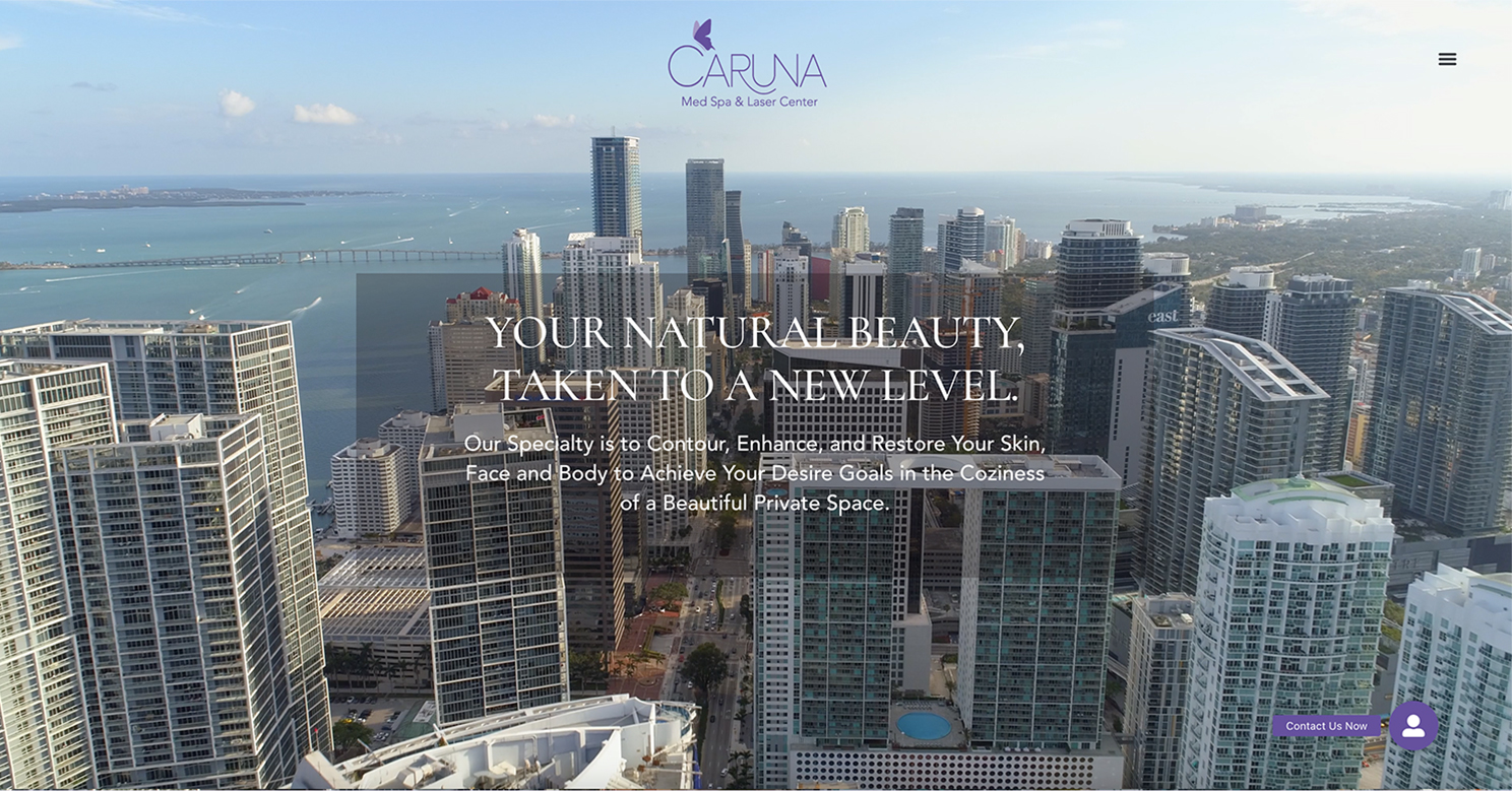
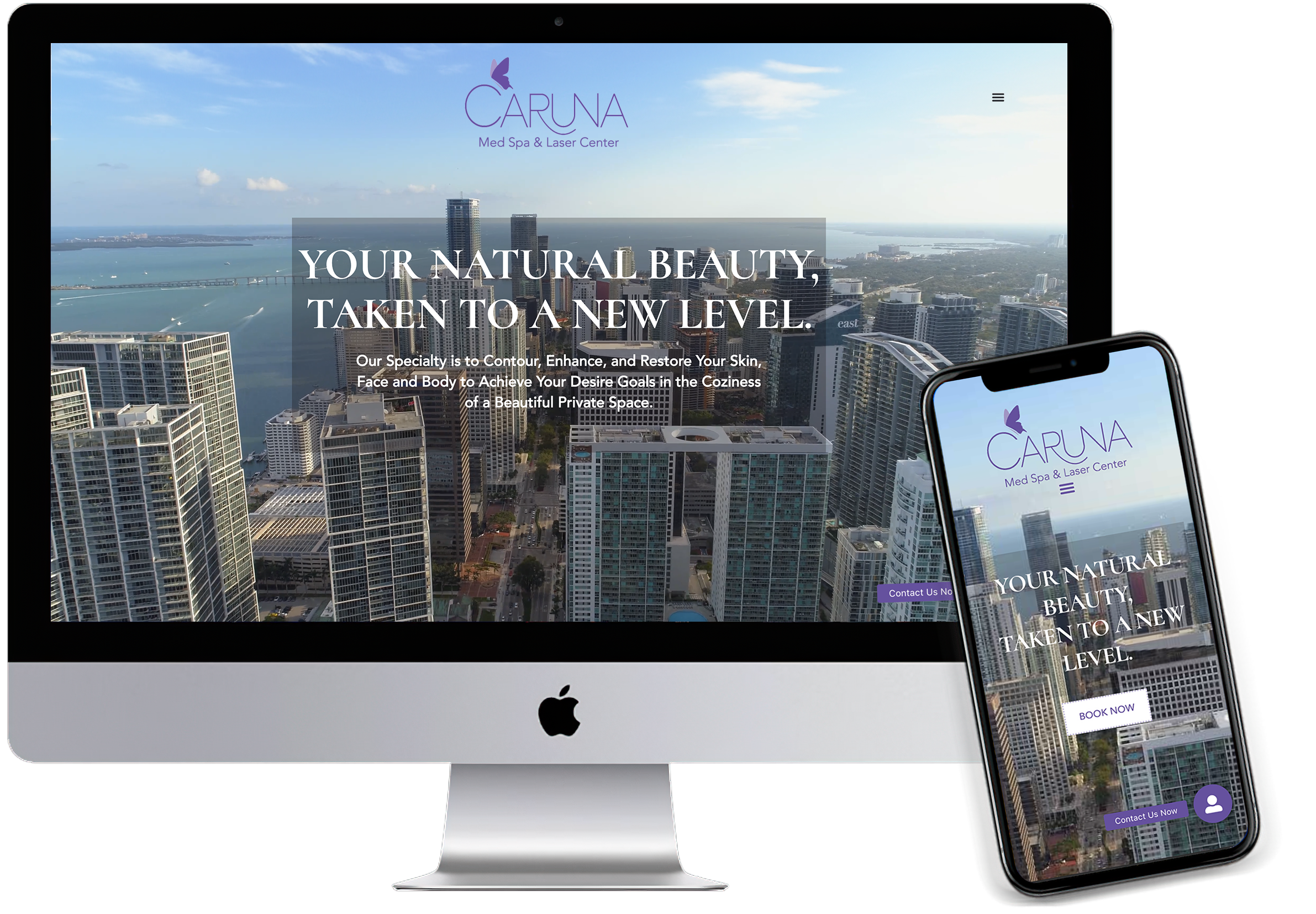
For the hero section, instead of a static image, the website displays an aerial, panoramic video of downtown Miami and its beautiful beaches. This dynamic visual element, not only captures the visitor’s interest, but provides a sense of immersion, making them feel like they are experiencing the location firsthand. In addition, we decided on the value proposition, “Your Natural Beauty Taken to a New Level,” in a large elegant font, which conveys the main benefit of the service.

The purple is chosen to increase visibility.

The choice of fonts throughout the site plays a crucial role in establishing an elegant and sophisticated tone throughout the website.
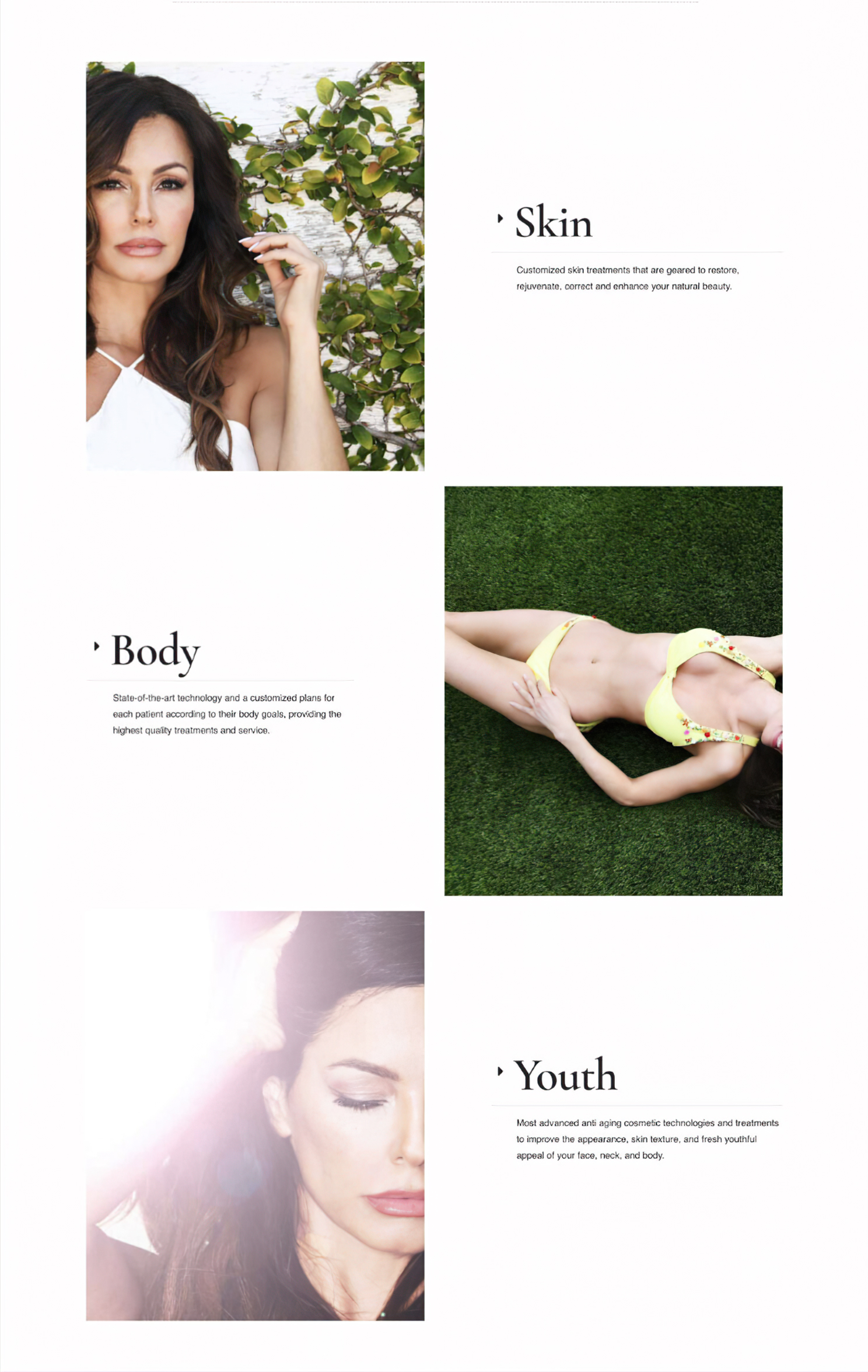
The generous use of open, white space allows each element to stand out and be appreciated individually, while creating a sense of luxury and exclusivity. The staggered photo sections add visual interest The callouts with large type provide information, while offsetting the staggered photo sections.

Testimonial for social affirmation. The deep purple gradient adds contrast to the light, open sections.
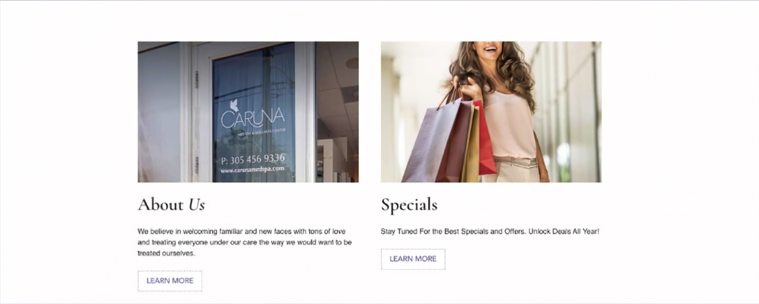
Secondary elements with call-to-action buttons to learn more.

Tinted purple breaks up the light background above and below.

Footer section includes contact info, social media icons and reviews icons.
The impact
The new website has given the client the confidence to promote her services to prospects in an affluent and competitive market. The client relies primarily on Google Adwords, which can get quite pricey, considering the particular keywords in her marketplace.
The client is in a stronger position for her investment in Google Adwords to yield higher results in terms of attracting more clientele.
“I have had the opportunity and the blessing to work with Mark a couple of times. Both times for a brand new website design and configuration. It is simply a pleasure to work with someone so responsive, so patient, so professional and most important, so fast! It is delightful when someone understands your taste and your preferences. It has been a great and fun journey working together, creating together and having a final result that has me jumping in one leg every time I open the web or every time my customers have something beautiful to say about it. Thank you so much Mark, I can’t thank you enough and I can’t wait for our next project because it will always be you!
~ Carolina Lizarazo, Owner
I have had the opportunity and the blessing to work with Mark a couple of times. Both times for a brand new website design and configuration. It is simply a pleasure to work with someone so responsive, so patient, so professional and most important, so fast! It is delightful when someone understands your taste and your preferences. It has been a great and fun journey working together, creating together and having a final result that has me jumping in one leg every time I open the web or every time my customers have something beautiful to say about it. Thank you so much Mark, I can’t thank you enough and I can’t wait for our next project because it will always be you!
~ Carolina Lizarazo, Owner


